 English
 عربى
عربى Español

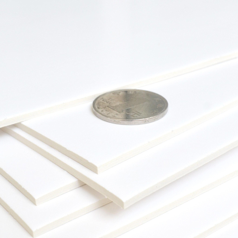
Ivory Board Paper, renowned for its distinctive off-white hue, holds a unique position in the realm of paper products. Beyond its physical attributes, the color of Ivory Board Paper plays a pivotal role in determining its suitability for diverse applications. In this article, we delve into the significance of Ivory Board Paper color and its impact across different usage scenarios.
The Aesthetic Appeal:The ivory color of Ivory Board Paper exudes elegance and sophistication, setting it apart from standard white or colored papers. This subtle yet distinct shade adds a touch of luxury and refinement to any project it is applied to. Whether used for premium packaging, high-end stationery, or luxury invitations, the ivory hue elevates the visual appeal and creates a lasting impression.
Enhancing Brand Identity:For businesses seeking to establish a distinct brand identity, the color of Ivory Board Paper can be instrumental. The subtle warmth of ivory resonates with notions of tradition, quality, and exclusivity, making it an ideal choice for brands aiming to convey these attributes. From product packaging to corporate collateral, Ivory Board Paper in its characteristic color can reinforce brand positioning and evoke a sense of prestige.
Complementing Vintage and Rustic Themes:In creative endeavors such as scrapbooking, card making, or vintage-themed projects, the ivory color of Ivory Board Paper serves as a versatile canvas. It harmonizes effortlessly with rustic textures, vintage patterns, and sepia-toned imagery, lending a nostalgic charm to the overall design. Whether crafting handmade cards, journal pages, or decorative elements, the subdued elegance of ivory adds depth and character to the composition.
Softening Visual Impact:In applications where stark white paper might appear too harsh or clinical, the gentle warmth of ivory offers a softer alternative. For presentations, reports, or documents intended for prolonged reading, Ivory Board Paper can reduce eye strain and create a more comfortable viewing experience. Its muted tone provides a neutral background that complements text and graphics without overwhelming the reader.
Creating Contrast and Emphasis:Contrast plays a vital role in graphic design and visual communication. Against bold colors or vibrant imagery, the ivory color of Ivory Board Paper can serve as a striking contrast, drawing attention to key elements and enhancing their impact. Whether used as a backdrop for product photography, packaging labels, or promotional materials, the subtle contrast provided by Ivory Board Paper enhances visibility and legibility.
Conclusion:The color of Ivory Board Paper is not merely a matter of aesthetics; it is a strategic choice that influences the perception and effectiveness of various applications. From imparting a sense of luxury and refinement to enhancing brand identity and visual communication, the ivory hue of Ivory Board Paper offers a versatile canvas for creative expression across diverse industries and projects. Understanding its significance empowers designers, marketers, and businesses to harness its inherent qualities and create impactful experiences for their audience.


